

Colour is a powerful tool in branding, profoundly influencing consumer perceptions and behaviours. In today’s competitive marketplace, where consumers are bombarded with countless brand messages daily, the strategic use of colour can be the distinguishing factor that captures attention and fosters brand loyalty.
Research indicates that up to 90% of initial product assessments are based solely on colour, underscoring its critical role in consumer decision-making. Moreover, colour can enhance brand recognition by up to 80%, making it an indispensable element in establishing a memorable brand identity.
Beyond aesthetics, colours evoke specific emotions and associations. For instance, blue often conveys trust and professionalism, which is why many financial institutions incorporate it into their branding. Conversely, red can evoke excitement and urgency, making it a popular choice for brands aiming to stimulate quick consumer responses.
Understanding the psychological impact of colour is essential for brands aiming to resonate with their target audience. By thoughtfully selecting colours that align with brand values and appeal to desired emotions, businesses can create a compelling visual identity that stands out in the marketplace.
In the following sections, we will delve deeper into the psychology of colour, explore how successful brands effectively utilise colour in their branding strategies, and provide insights into selecting the right colour palette for your brand.
What do Different Colours Mean in Branding?
In branding, colours evoke specific emotions and perceptions that can significantly influence how consumers interact with a brand. Here’s an in-depth look at what different colours represent, along with examples from globally recognised brands.
Red – Energy, Passion, and Urgency
Red is a bold, attention-grabbing colour that evokes strong emotions. It is often associated with excitement, passion, and urgency, making it a popular choice for brands aiming to stimulate appetite or encourage quick decision-making. For example, Coca-Cola uses red to convey excitement, passion, and energy, creating a globally recognisable and emotionally engaging brand identity.
- Common Associations: Energy, excitement, love, passion, urgency
- Best For: Food brands, entertainment, retail
Orange – Creativity, Enthusiasm, and Friendliness
Orange blends the energy of red with the cheerfulness of yellow, resulting in a vibrant, playful hue. It conveys warmth, enthusiasm, and creativity, often making brands feel approachable and fun. For example, Fanta uses bright orange to represent fun, playfulness, and creativity, appealing to a youthful and energetic audience.
- Common Associations: Creativity, enthusiasm, friendliness, fun
- Best For: Travel, technology, food, children’s products
Yellow – Optimism, Happiness, and Attention
Yellow is the most visible colour and is associated with happiness, optimism, and warmth. It grabs attention quickly and stimulates mental activity. For example, McDonald’s uses yellow to evoke happiness and optimism, creating a sense of friendliness and approachability, especially when paired with red to stimulate appetite.
- Common Associations: Happiness, optimism, energy, warmth
- Best For: Food, retail, hospitality
Green – Health, Growth, and Tranquillity
Green is often associated with nature, health, and tranquillity. It represents growth, balance, and renewal, making it a popular choice for brands focused on health or sustainability. For example, Starbucks uses green to symbolise freshness, growth, and relaxation, aligning perfectly with its café culture and brand ethos.
- Common Associations: Nature, growth, health, balance
- Best For: Health and wellness, finance, eco-friendly products
Blue – Trust, Stability, and Professionalism
Blue is the most widely used colour in corporate branding due to its associations with trust, stability, and professionalism. It has a calming effect and is often used in industries like finance, healthcare, and technology. For example, Facebook uses blue to evoke trust, security, and connection, reinforcing its role as a global social platform.
- Common Associations: Trust, stability, calmness, professionalism
- Best For: Finance, healthcare, technology, corporate brands
Purple – Luxury, Creativity, and Wisdom
Purple combines the stability of blue with the energy of red, often symbolising luxury, creativity, and wisdom. Historically associated with royalty and wealth, purple is used by brands aiming to project sophistication or indulgence. For example, Cadbury uses purple to convey luxury, indulgence, and quality, reinforcing its reputation as a premium chocolate brand.
- Common Associations: Luxury, creativity, spirituality, ambition
- Best For: Beauty, luxury products, creative industries
Pink – Compassion, Playfulness, and Femininity
Pink is often associated with love, compassion, and playfulness. It conveys nurturing and warmth, making it a popular choice for brands targeting women or children. For example, Barbie uses pink to emphasise femininity, playfulness, and imagination, perfectly aligning with its young audience.
- Common Associations: Love, playfulness, femininity, romance
- Best For: Beauty, fashion, children’s products, wellness
Black – Sophistication, Power, and Elegance
Black conveys sophistication, luxury, and power. It’s often used by high-end brands to project exclusivity and elegance, though it can also evoke modernity and minimalism. For example, Chanel uses black to express timeless elegance, luxury, and high fashion, reinforcing its status as a premium brand.
- Common Associations: Power, elegance, sophistication, authority
- Best For: Luxury goods, fashion, technology
White – Simplicity, Purity, and Clarity
White represents simplicity, cleanliness, and purity. It is often used as a background colour to create a sense of space and clarity in design, making it ideal for minimalist branding. For example, Apple uses white to highlight simplicity, modernity, and innovation, reflecting its clean product design and user-friendly interfaces.
- Common Associations: Purity, simplicity, cleanliness, minimalism
- Best For: Healthcare, technology, lifestyle brands
Brown – Reliability, Warmth, and Earthiness
Brown evokes a sense of reliability, stability, and warmth. It’s commonly associated with natural and organic products, as well as brands that want to convey authenticity and wholesomeness. For example, UPS uses brown to represent dependability and trustworthiness, aligning with its logistics and delivery services.
- Common Associations: Earthiness, reliability, warmth, simplicity
- Best For: Food, agriculture, coffee brands, organic products
Grey – Neutrality, Balance, and Sophistication
Grey is a neutral, balanced colour often used in modern and minimalist designs. It can convey sophistication and professionalism while serving as a complementary colour that allows brighter hues to stand out. For example, Mercedes-Benz utilises grey to convey luxury, sophistication, and high performance, reflecting its premium automotive brand.
- Common Associations: Balance, neutrality, calmness, professionalism
- Best For: Technology, automotive, corporate branding
By understanding the psychological meanings behind colours and how global brands use them, businesses can make informed decisions when crafting their visual identity. The right colour choice not only enhances brand recognition but also strengthens emotional connections with the target audience.

How can You use Colour Theory to Your Advantage?
Colour theory is more than just understanding what each colour represents — it’s about using that knowledge strategically to create visual harmony, evoke specific emotions, and drive customer behaviour. By leveraging colour theory, brands can craft powerful visual identities that resonate deeply with their audience.
Start by identifying the core emotion or message you want your brand to convey. For example, if you’re a health and wellness brand, you might opt for calming greens and blues to evoke feelings of tranquillity and trust. On the other hand, a fast-food brand might use bold reds and yellows to stimulate appetite and create a sense of urgency.
Colour contrast and balance also play a significant role. High-contrast colour combinations, like red and white, draw attention and can highlight calls-to-action (CTAs) on websites or packaging. Meanwhile, analogous colours (those next to each other on the colour wheel, like blue and green) create a more harmonious and calming effect, ideal for brands that want to appear approachable and trustworthy.
Additionally, consider cultural nuances and accessibility. Certain colours carry different meanings across cultures — red symbolises luck in China but can signify danger in Western countries. It’s also essential to ensure your colour choices are accessible to all users, including those with visual impairments. High-contrast combinations and clear design choices help improve readability and inclusivity.
Ultimately, using colour theory to your advantage means being intentional with your choices. Every colour should serve a purpose, whether it’s to build brand recognition, evoke an emotional response, or guide customer actions.
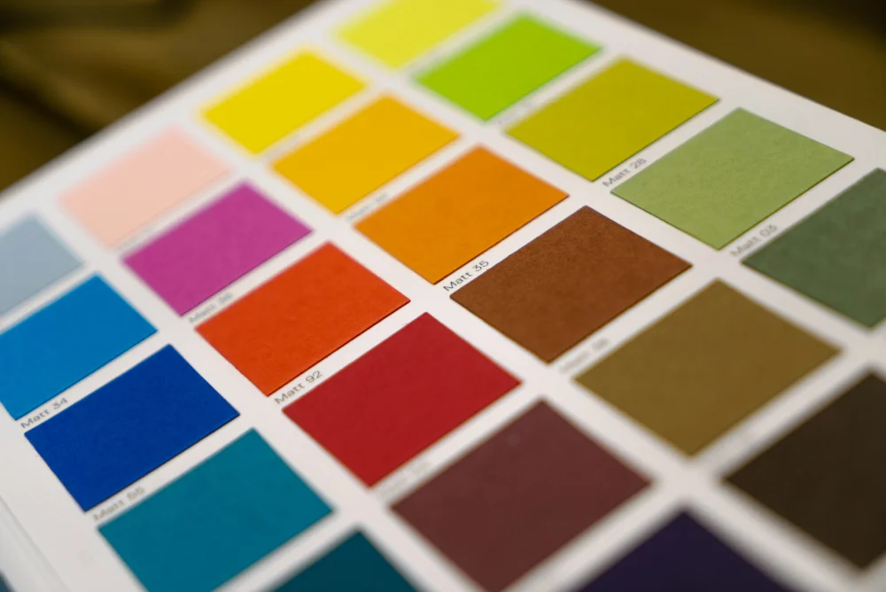
What About Selecting Multiple Colours?
Choosing multiple colours for your brand isn’t just about picking your favourite shades — it’s about creating a cohesive, balanced palette that enhances your messaging and appeals to your target audience. A well-thought-out colour scheme helps establish visual hierarchy, guides user behaviour, and strengthens brand recognition.
When selecting multiple colours, it’s crucial to define a primary brand colour — the shade most closely associated with your identity. Think of Coca-Cola’s red or Facebook’s blue. This primary colour should dominate your branding and be instantly recognisable.
Next, select secondary and accent colours to complement the primary hue. Secondary colours are used to add variety and depth, while accent colours highlight specific elements, such as CTAs, promotional banners, or important information. For example, Spotify primarily uses green but incorporates black and white as secondary colours, creating a modern and balanced aesthetic.
A helpful approach is to use colour harmony principles, such as:
- Complementary Colours: These are opposite each other on the colour wheel (e.g., blue and orange) and create vibrant, high-contrast combinations that stand out.
- Analogous Colours: These are next to each other on the colour wheel (e.g., blue, teal, and green) and offer a more harmonious, calming effect.
- Triadic Colours: This scheme uses three colours evenly spaced around the colour wheel (e.g., red, yellow, and blue) for a balanced but dynamic look.
It’s also important to consider how colours will interact in different applications. A palette that looks great on a website may not translate as well to print materials or packaging. Test your colour combinations across various mediums to ensure consistency and visual appeal.
Finally, don’t forget about contrast and accessibility. Ensure that text and important elements stand out against background colours, and follow web accessibility guidelines to accommodate users with visual impairments.
Selecting multiple colours thoughtfully allows your brand to have flexibility and visual interest while maintaining a cohesive and recognisable identity.
Book a Digital Marketing Roadmap Session
At Somer Design, we don’t just help you choose the right colours, we help you craft a comprehensive digital strategy that ensures your brand stands out and connects with the right audience.
Our Digital Marketing Roadmap Session is designed to give you a clear, actionable strategy for growth. We will evaluate your current branding and marketing efforts, identify key areas for improvement and provide tailored recommendations for increasing visibility, engagement, and conversions.
Are you ready to elevate your brand and boost your digital marketing strategy? Book your Digital Marketing Roadmap Session today and take the first step toward lasting business growth.