In the modern online world, branding is everything! A well-established brand is essential to building a memorable and trustworthy business. If you haven’t assessed your brand recently, we encourage you to read the article below. It outlines 7 ways you can elevate your brand identity.

Never Miss an Edition of The Roundup
The Roundup is your fortnightly digital marketing tip, trick, or trend from the Somer Design Team. Sign up to never miss an edition: https://somerdesign.activehosted.com/f/7
The Article: The 7 Key Elements of Brand Design
In this post, I’ve assembled information that’s scattered across the web to provide an authoritative guide to corporate brand identity design. I’ve boiled it down to 7 elements that you’ll need to include as you create your own brand identity design and work toward the larger goal of building a well-loved brand.
Before we go over the 7 elements of brand identity design, we need to align on a few key definitions. First of all:
What is a brand?
The word “brand” is used pretty loosely these days. For example, people might use the word “brand” to talk about logos, though a logo is just one part of a brand. It’s a symbol that represents a deeper emotional tie.
Seth Godin has a great definition of brand that addresses this point: “A brand is the set of expectations, memories, stories and relationships that, taken together, account for a consumer’s decision to choose one product or service over another.”
A logo, packaging, typography, and personality all represent a brand, along with customer service, price, product quality, and corporate responsibility, but a brand is a bit more intangible. It’s emotional, visual, historical, and human. It’s an experience that separates different products and services in a world where quality is often comparable or the same.
What is brand identity?
Brand identity is the face of a brand. As discussed in the previous section, a brand is an emotional and even philosophical concept, while brand identity is the visual component of a brand that represents those larger ideas.
Brand identity includes logos, typography, colours, packaging, and messaging, and it complements and reinforces the existing reputation of a brand. Brand identity attracts new customers to a brand while making existing customers feel at home. It’s both outward- and inward-facing.
It’s vital that brand identity be consistent. Because it’s representing and reinforcing the emotions of a brand, the message portrayed by brand identity components needs to be clear, and it needs to be the same no matter where it’s displayed.
To manage brand identity, organizations should invest in a brand management system that helps them stay consistent while still having the flexibility and the speed necessary to succeed in today’s market. Components of this system might include a style guide, brand management software, and employee training.
So what is brand identity design, and how do you create a brand identity?
Basically, it’s brand identity applied. Brand identity design is the actual process of creating the logo, colour palette, typography, etc.
With these definitions in mind, what follows is an overview of the 7 key design elements you need to create a brand identity that is strong, consistent, and attractive.

1. Clear brand purpose and positioning
The first part of establishing a brand identity is determining what your purpose and positioning is. The brand purpose is the big reason for your existence. Brand positioning is the naming of who your product is for and why your product is a better option than the competitors. Defining these will inform your strategy as you create a logo, decide on a color palette, etc. A process called Purpose, Position and Personality is useful for answering these questions (we’ll talk more about personality in the next section).
According to Arielle Jackson, startup founder and Google veteran: “Your purpose is how you want to change the world for the better.” Jackson also recommends this diagram as a guide for determining your purpose:
Jackson explains the diagram this way: “In one circle, you have cultural tension. This is what is happening in the world that’s relevant to you. In the other circle, is your brand’s best self. This is what your company delivers at its prime,” says Jackson. “The intersection of these two areas is… ‘the big ideal’ — or your purpose.” For a great example of a succinct, tangible corporate purpose, check out this statement from Apple: “Apple’s 100,000 employees are dedicated to making the best products on earth, and to leaving the world better than we found it.” Not too shabby.
Brand positioning is the process of making the purpose actionable. By naming your target customer and differentiating yourself from the competition, you lay the groundwork for your brand to accomplish your purpose.

2. Thorough market research
A brand’s purpose and positioning can be informed, at least in part, by market and customer research. To understand the cultural tension described in the previous section, research is crucial. For beginners to market research, there is a wealth of content online to help.
One of the best ways to conduct market research is to simply talk to people. Phone interviews allow for detailed discussions and place a helpful emphasis on the human element of research—an element that’s essential if you want to make an emotional appeal to customers.
Beyond phone interviews, online survey tools, like Survey Monkey, are a fast way to gather a lot of information, and government resources can also be a powerful tool.
Good market research can also help you determine who your main customer personas are, a term which I’m using here to indicate a slightly different concept than “target customers,” which was mentioned earlier. Your customer persona goes beyond just defining what problem a customer has and details some of the professional and personal traits of your focus customers. Defining these traits will help you know what kind of a personality your brand should have to be appealing to customers.

3. Likable brand personality
Something I’ve heard several times is the question “If your brand were a person, what would they be like?” It might be a bit cliché at this point, but it’s a smart way to think about brand personality.
And brand personality is an important thing to consider. It will come through in every part of your brand identity if you get it right. Brand personality has a huge impact on the voice and tone used in your marketing materials and other communications. If a personality isn’t established, customers will get mixed messages and have trouble connecting with your brand.
If you’re having a hard time getting started, here’s an exercise to try: Which celebrities best represent your brand? Is there an actor or actress, musician, or public personality that embodies the same traits as your brand? This could be a good starting point for nailing down different aspects of your brand’s personality.

4. Memorable logo
Which came first—the logo or the brand? It’s difficult to say, because logos and brands are constantly being refined and adjusted, but by and large, a clear brand should come first, followed by a logo that matches, compliments, and enhances that brand.
Your logo is central to your brand identity design. It’s the piece of your brand identity that people will be exposed to the most. It needs to line up with all the other elements of your brand identity, as well as the broader emotional appeal of your brand. For example, take a look at this logo:

What do you think of? I bet you noticed it earlier and instantly thought of nostalgia, magic, laughter, or something similar. The playful script oozes with creativity and fun, and that jives with the overall brand Disney has established.
To increase your chances of having a memorable logo that encourages a strong emotional response, go for a simple look. Take a look at the logos of the world’s top 3 brands (according to Interbrand):


They’re simple and instantly recognizable. Even Coca-Cola’s logo, the most complex of the three, is just a straight line of text in a single font, with no graphical elements surrounding it.
When a logo is simple, it becomes an open canvas customers can fill with positive experiences they have with the brand. Also, the simpler the logo, the easier it is to scale between mediums such as digital advertising and the more traditional print advertising such as flyers or brochures.
The final thing to consider when designing a brand logo is all the places a it could possibly be displayed. A logo needs to be flexible enough to look great on a huge billboard or as a tiny social media icon. Simplicity is helpful here as well.

5. Attractive colour palette
Related to logo design is the colour palette. This should also be simple, with only 1 to 3 primary colours (though Google got away with 4). Knowing a bit about the emotions conveyed by certain colours can help you select the right ones.
A lot of colour psychology is intuitive, like blue expressing calm and red and yellow expressing passion and energy. Depending on the tint or shade of a colour you use, that emotion can be adjusted. A tint is the colour mixed with white, making it lighter, and a shade is the colour mixed with black, making it darker. A lighter tint of blue conveys tranquillity, while a darker shade of blue often conveys trust, an effect that many banks use in their colour schemes.
As mentioned earlier, brands should have only a few primary colours, but you can also select secondary colours to be used alongside your primary colours in some of your materials. Selecting a few additional colours helps your brand stay exciting but still on brand.
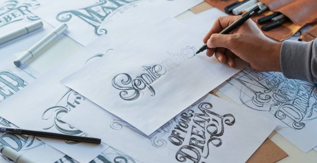
6. Professional typography
Stressing about finding just the right font may lead others to designate you a “typography nerd,” but you’ll come out ahead when you pick a font that works in harmony with your logo and colours.
Fonts are powerful. The most famous fonts are recognizable even when taken out of context. You’ll want a single primary typeface to lead your brand design, and it should work well with your logo and your colour palette. It should also, like your logo and colour palette, be simple.
If you’d like to know more, I found this beginner’s guide to typography helpful. It covers a few best practices:
- Don’t use fancy fonts (especially if you don’t have the experience or knowledge to use them well).
- Don’t avoid default fonts. They’re readable, and you can set the typeface differently if you want it to stand out.
- Don’t mix more than two font families at a time.
- Do mix contrasting fonts (such as a serif and a sans-serif).
- Choose the right font size and line length for legibility.
- Align your text to the left. A ragged right is easy to read.
- If it’s over 60 characters per line, it’s okay to justify it. However, avoid hyphenation.
- Don’t use all-caps to emphasize text.
Of course, all of these rules can be broken if you know how to do it effectively. The key is understanding why the best practices work, so you can justify bending the rules for your brand identity.

7. On-brand supporting graphics
Since we live in a multimedia world, the final step in creating a brand identity is an extended visual language with supporting graphics, design assets, icons and photographs.
Take a look at Google’s Visual Assets Guidelines to see how they carefully explain their take on icon design. They cover a whole range of brand design considerations:
- A reductive (or “flat”) approach
- A preference for geometric shapes
- Icons always face front
- Straight, hard shadows as opposed to curved, soft ones
- Standard background colours
- Icons align to the pixel grid
- Icon padding according to shape
Because of Google’s close attention to their extended visual language, when you see a Google icon, you know it’s a Google icon.
Creating a brand guide that addresses multiple elements of brand design will help streamline the production of ad materials in the future. This ensures that every email newsletter, social media post, or promotional pamphlet adheres to the same familiar standards.
Distribute brand assets
Once you’ve determined the core elements of your brand identity, establish clear brand guidelines in a brand style guide. The style guide should provide clear direction on how your logo, brand colours and typography should be used.
Providing brand assets such as business cards, email signatures, social media banners and content templates can also streamline brand guideline adoption.
Create a brand assets hub that can act as a one-stop shop for anyone needing to download the current logo, image files or brand colour hex codes.
Maintaining a brand identity
Building a brand identity requires more than simply identifying your visual brand components. Your brand image is ultimately made up of how your brand is perceived over time. Being consistent in presentation and tone is critical to a cohesive brand strategy. Be sure to educate employees on the importance of the company’s brand and use templates and other brand management tools to ensure content stays on-brand.