A call to action AKA CTA on your website or social media channels is a prompt or a trigger for your customer or potential customer to take a specific action. It is one of THE most important elements of your website and in fact, can be the key determining factor in whether your website is doing its job.
The primary aim of a CTA is to engage with your audience and motivate them to take steps to become a client, and that is the ultimate aim of any website.
According to an article in The Guardian, the total amount of time spent online by Britons has doubled over the last 10 years, with a quarter of adults saying they spent more than 40 hours a week on the internet – a move driven by the uptake of smartphones.
Of this, according to the ecommercenews.eu, online shoppers in the United Kingdom make 87 percent of their retail purchases (grocery shopping not included) online.
For businesses therefore, not only is it imperative to have an online presence, be it a website or social media, but it’s vital for your target audience to receive the right cues in the form of CTA’s so that they can do what you want them to do to take them that much closer to engaging your services or purchase your product. The effectively serve as transitions between the various phases of the buyer journey, instructing the user on what to do next, prompting them to take action.
The most commonly used CTA’s are:
- Read more… to read a blog or article
- Download a PDF or e-Book
- Call us or email us
- Subscribe to our newsletter or email list.
- Buy now
- Add to basket
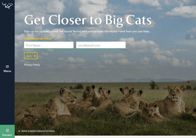
- Fill in a contact form
According to Marketing Experiments, consumers go through a six-step process before clicking a CTA on an email or landing page:
- Arrest attention
- Build connection
- Build problem
- Build interest
- Build suspense
- Transfer momentum
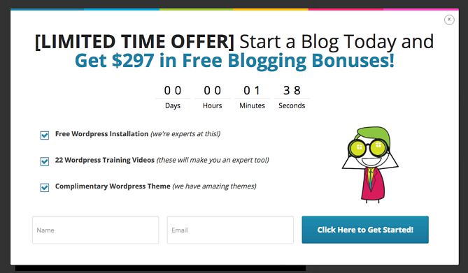
Three of the most important aspects of CTA’s are their frequency, their wording and their appearance.
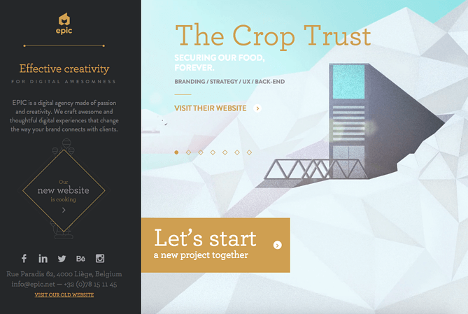
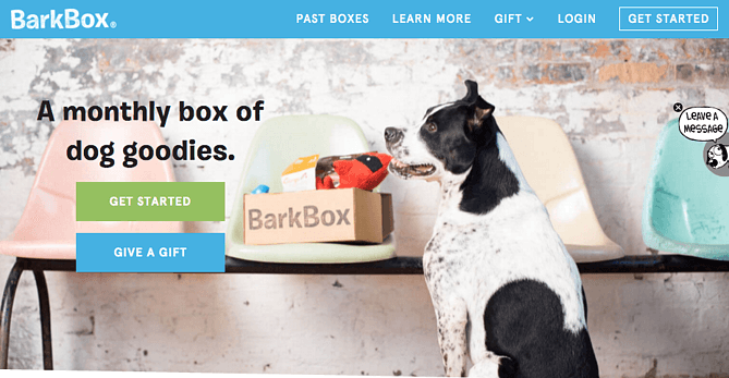
Marketing experts say that CTA’s should be used extensively and MUST be on every page of your website and must stand out.
What can you do to make your CTA stand out?
Colour the button – not white, grey, or black. The number of colour combinations, gradients, shadows, fonts, borders, and other options is infinite. Make it easy on yourself with this quick colour-choice checklist:It needs to stand out from the background.
It needs to not clash with the background.
It needs to grab your attention.
Keep it simple – Testing has proved that the best call to action button design choices are those that have a simple statement and few design frills. Midas Media recently conducted a test of 90 different high-conversion CTA buttons to see what they could uncover. What they found was that simpler designs seemed to have better results than buttons with a relatively more elaborate design.A simple element like “boring” font colours, such as white, was noted on almost all of the designs. This is likely the case because the highest performing button colours included orange, blue, red, or green. White is very readable on these colours and so would be a better choice than a “fancier” colour.
Size matters – Here’s the rule on size: Make your button a size that makes sense. Bigger is not always better. The whole point of a button is to make people click on it. So, make it easy for them to do so. If you make it too big, however, it looks odd or unnatural and may cause people not to click on it.
Don’t offer too many choices – whilst it’s always nice to have choices, too many can confuse your audience. Most of the best call to action button examples only offer the user one choice, or two, but the 2nd choice is a negative. For example, “I want more traffic to my website” as choice one and “I don’t want more traffic to my website, as choice two. Rarely is anyone going to click on option two.
Another instance in which you might use two CTAs is when you’re targeting two different audiences. For instance, you might ask your visitors to click on a CTA for men or another meant for women.
Make it look clickable- If the user is going to click on something, they need to know it’s clickable such as:
Have a rectangular shape
Have clear boundaries or borders
Have white space surrounding them.
Use a contrasting colour
Your button should look like a button to get more clicks.
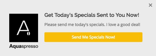
Keep the copy on the button short and sharp – it must be to the point and make the person reading it feel like its targeted to them. Your words like ‘your,’ and ‘you.’ For example, if you had to click on two buttons one of which said, “choose the colour” and the other one said, “choose your colour,” which are you more likely to click on?Use action words “Get,” “Reserve,” “Own,” “Dominate,” “See,” “Give,” “Use,” “Try” — these are all words that suggest action and momentum. Instead of using words like “Subscribe” or “Download,” try shaking things up with unique and action-oriented words.
You can also use timing words to create a sense of urgency like ‘today,’ or ‘now.’
The easier you make the next steps, the more likely will your audience take the call to action. Customers want to be told what to do to solve their problem as simply and as obviously as possible. They want answers to questions like:
How do I get more information?
How do I purchase this product?
How can I contact you?
I want a quote.
And attractive CTA buttons across your website and social media channels that answer these questions will go a long way in getting your customers to engage and eventually click buy.
The Somer Design team understands the importance of CTA’s. Each of the websites we’ve designed has well thought through CTA’s to engage and draw audiences in. Please visit our website to get an idea of the kinds of CTA’s we’ve created for our clients.
If you are thinking about getting your website built or redesigned, give us a call on 020 7112 9068 or email us at [email protected]. We understand the importance of building websites that work for businesses to increase their traffic and ultimately increase customers.